Mighty Beans:
Dare to be mighty
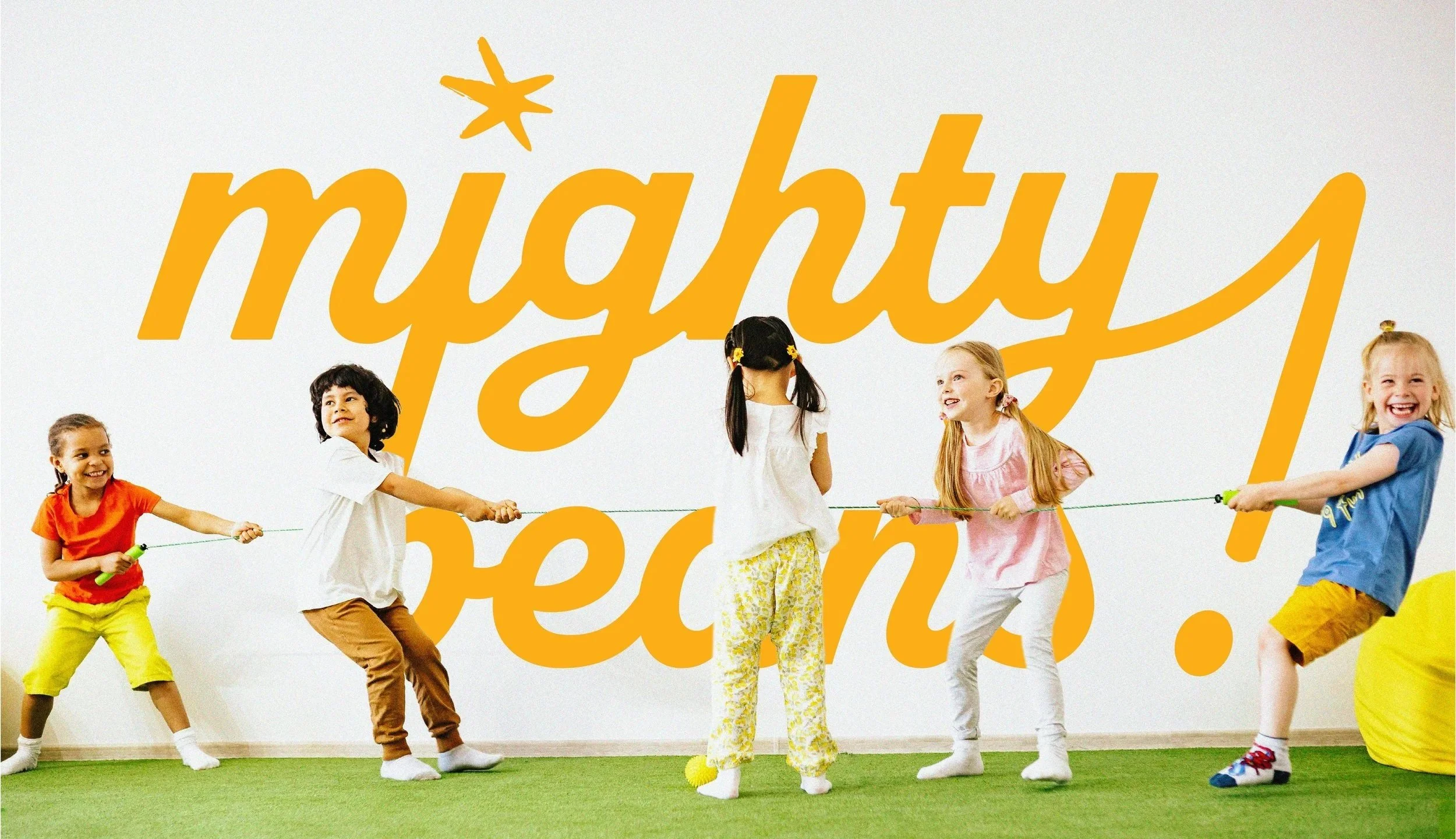
Mighty Beans is a children’s wellness brand that aims to create an intersection between kid-friendly visuals and whole nutrients that parents love. This redesign aims to mesh fun visuals with straightforward, honest, information about what parents are giving their growing children.
❋ The Goal
Design packaging that helps parents make the daily ritual of taking vitamins easier and more engaging for their littles.*
*This is a student project.
❋ The Inspiration
I am the proud aunt (and default baby-sitter) of 4 children under 12. One of their daily rituals when under my care, is taking their vitamins in the morning according to each of their individual needs. Mighty Beans is a brand identity that centers bright packaging and empowering copy in its quest to make staying healthy fun.
Snapshot
When brainstorming to determine who the ideal market consumer for this brand would be, it was decided that parents with kids ages 6-12, typically within the 28 to 35 range, were our ideal mark. Our hypothetical primary major retailers are Sprouts, Whole Foods, and Target. The brand will start with temp checks along the U.S Pacific and Atlantic coasts, and Greater British Columbia, with goals to grow inwards with company growth.
ORGANIC
DELICATE
INTIMATE
Logo story

TAY LULU


Kerning Minimized
Mimicking Lava Flow/Melted Metal

Welded Together
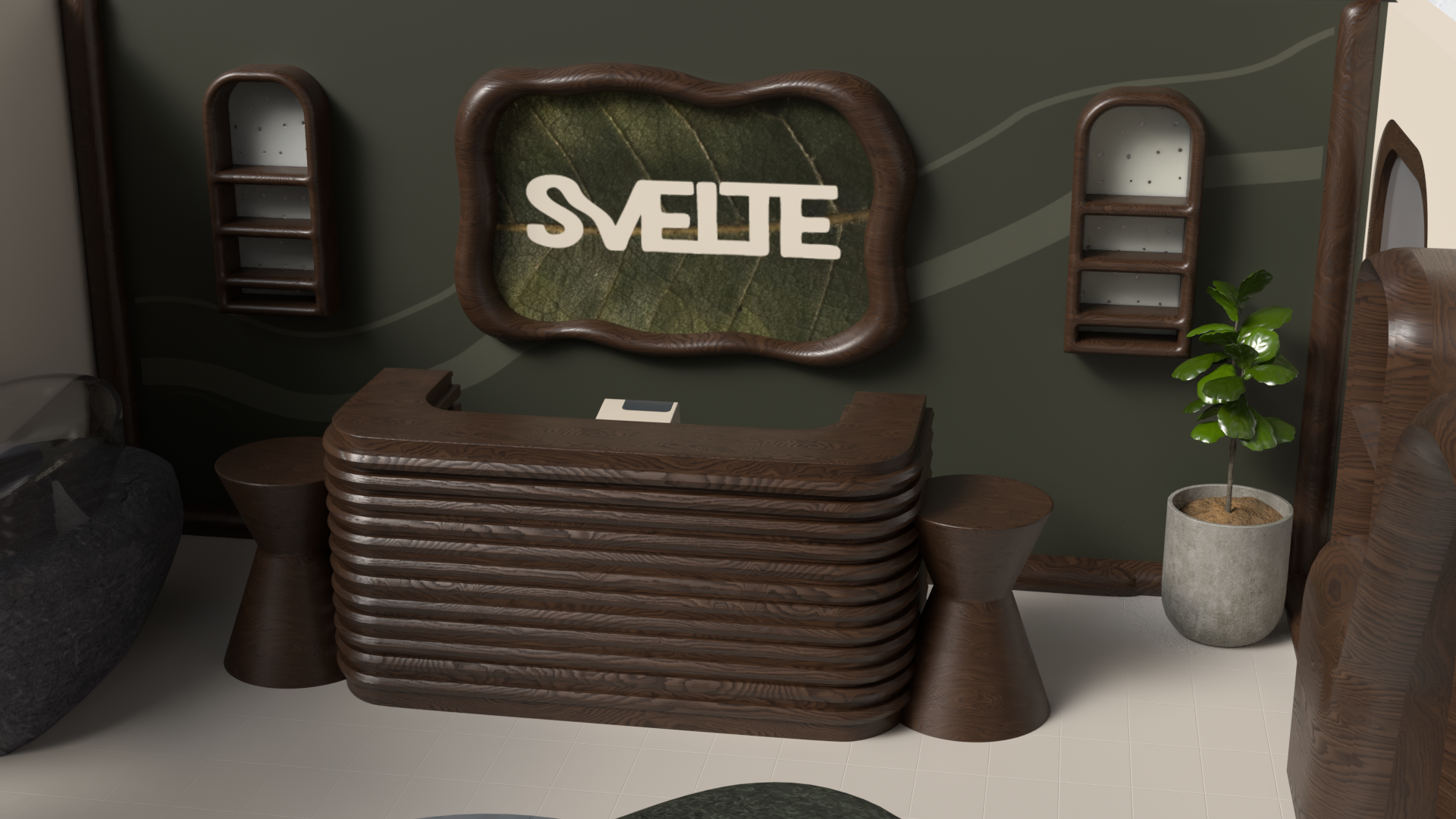
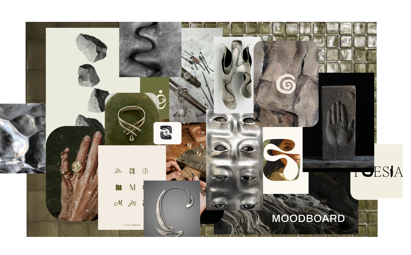
This logo focuses on the similarities between metal and stone. Both elements are associated with being interchangeably cool or warm- smooth or jagged; hard or soft. This logograph allows space for both to coexist. I imagine the space this introduces to harness the same ideals. Think glass tile with peppered grout, stainless steel chairs, and quartz-riddled granite countertops.
APPLICATION
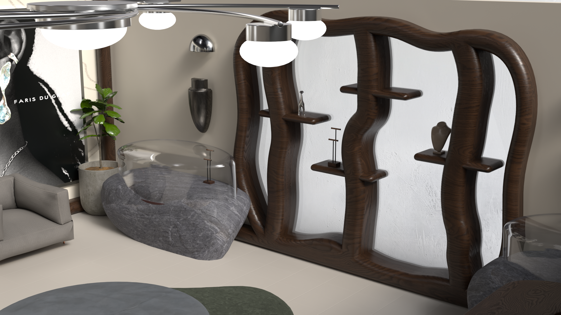
I sought out and sourced imagery from independent jewelers directly — crediting their work with full permission — and crafted handmade secondary elements into signage that actively champions their practice.
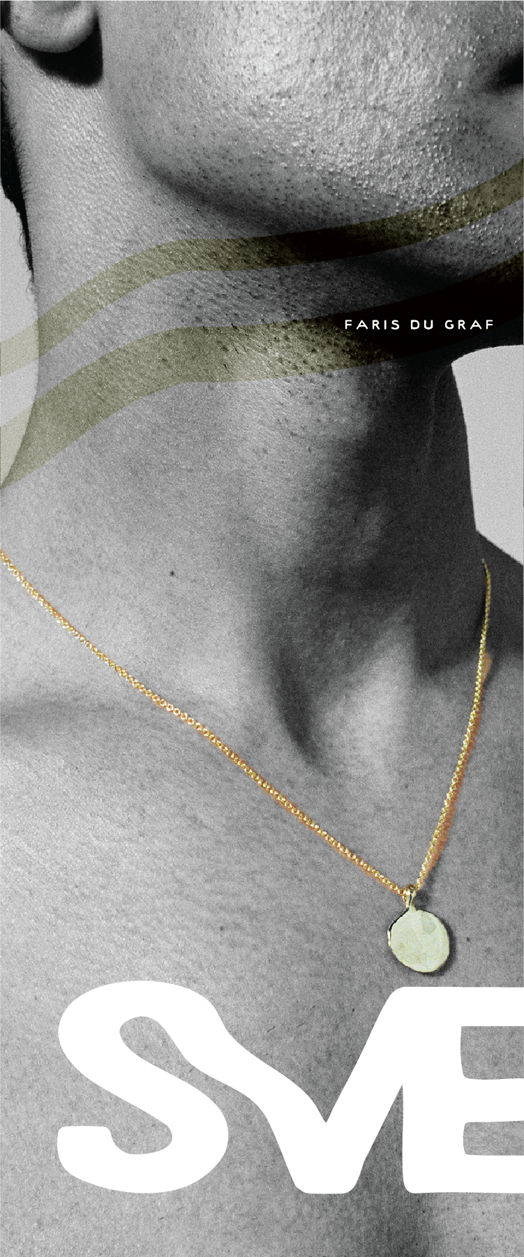
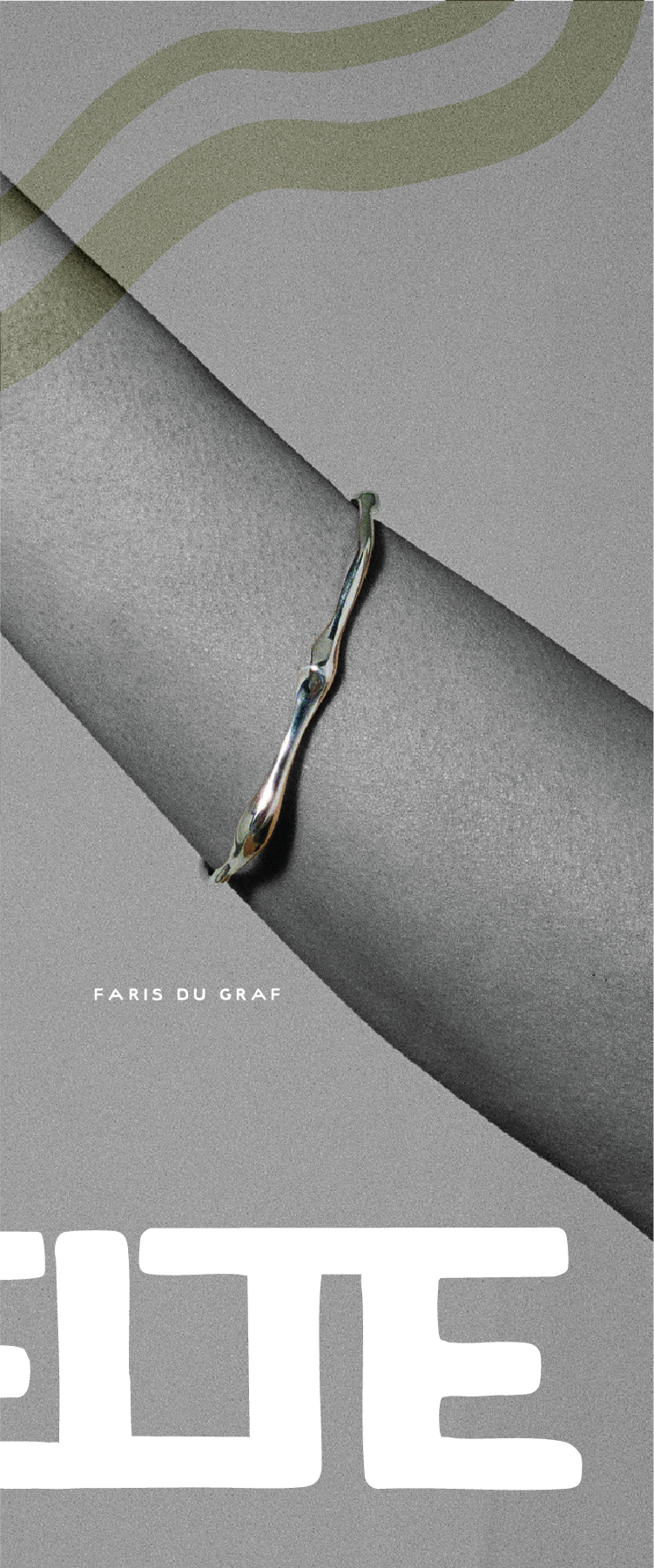
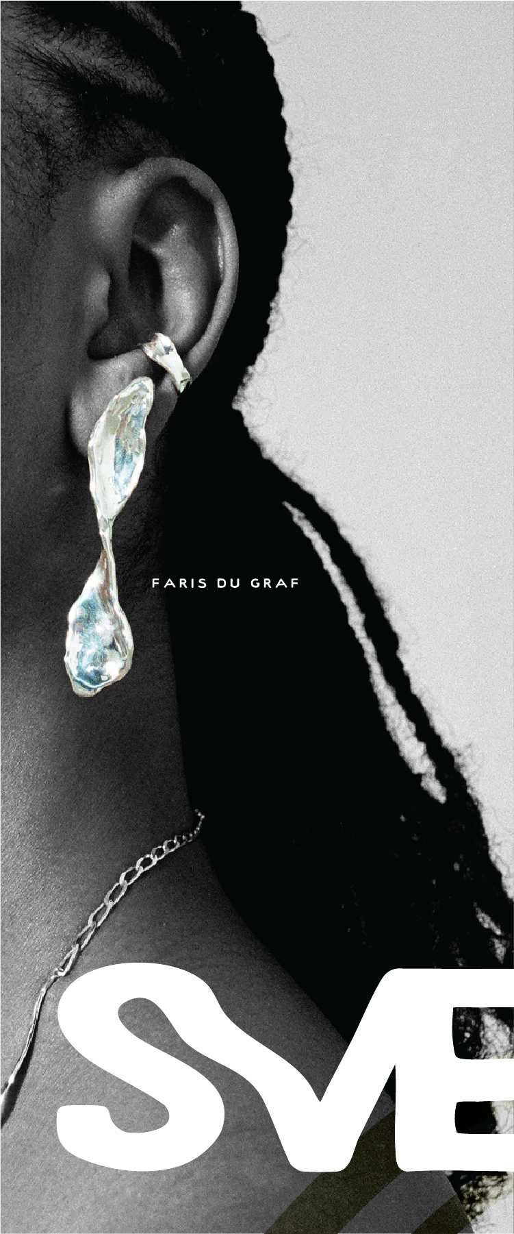
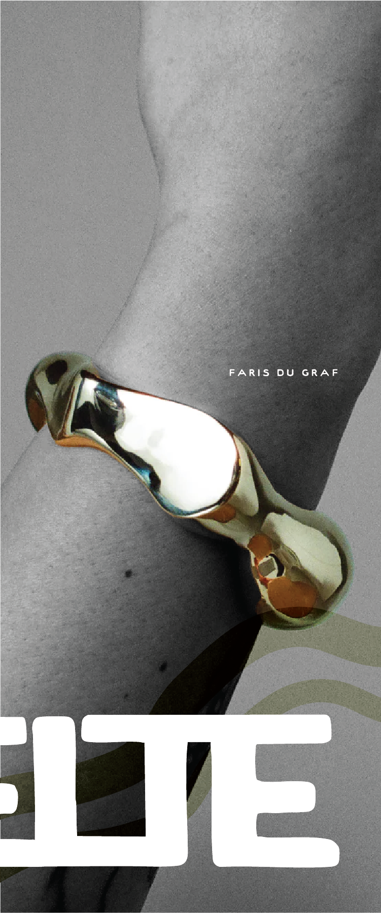
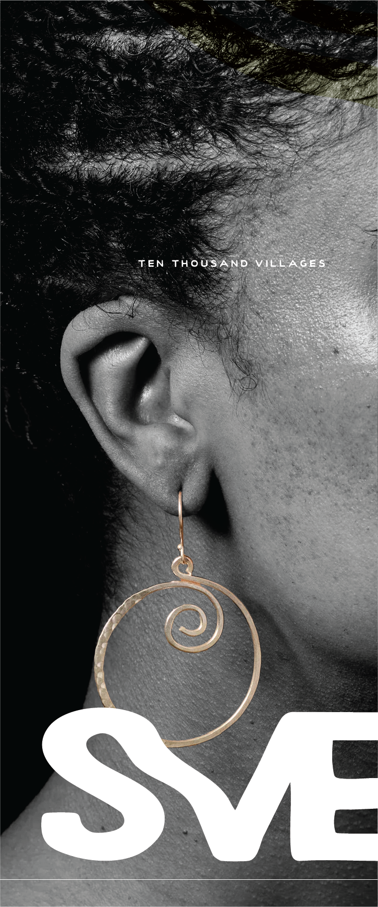
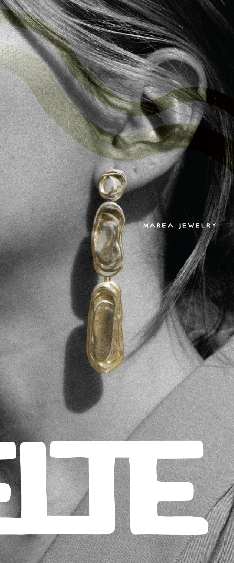
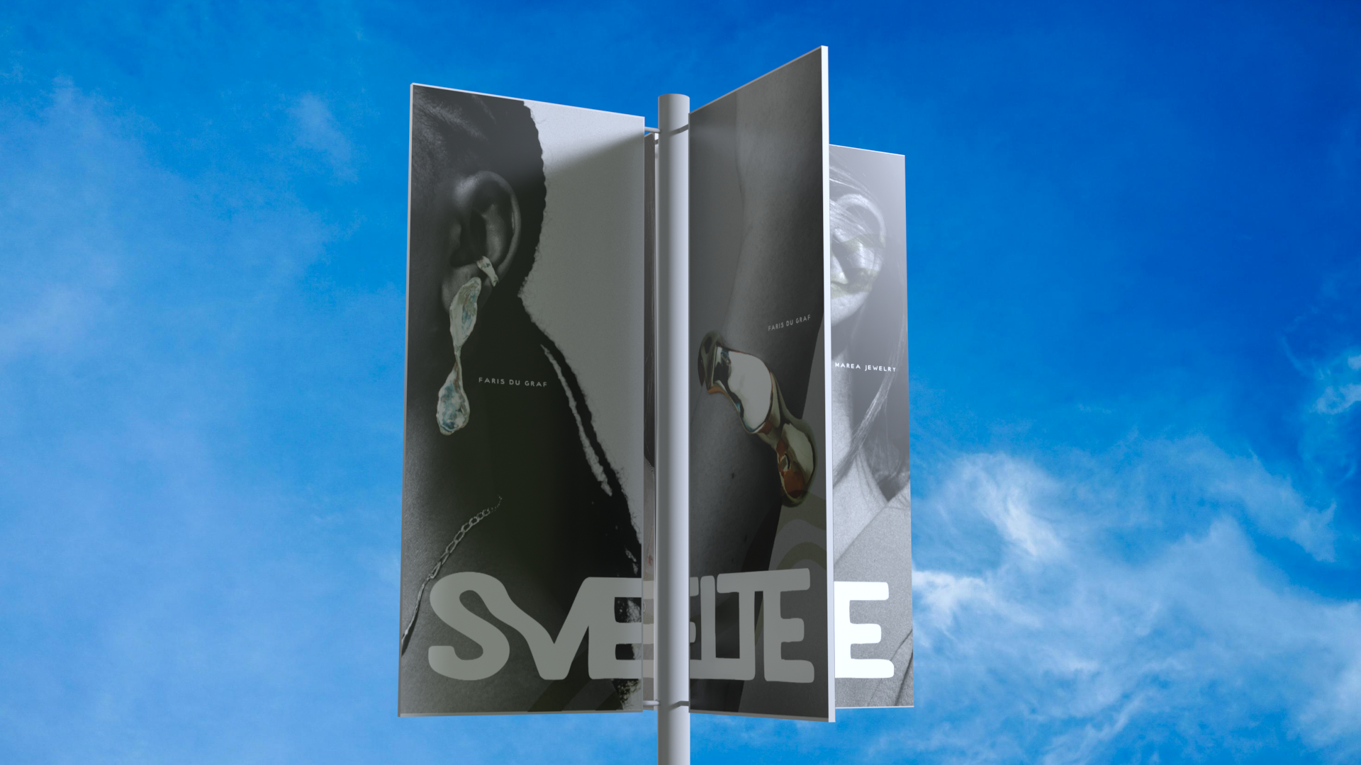
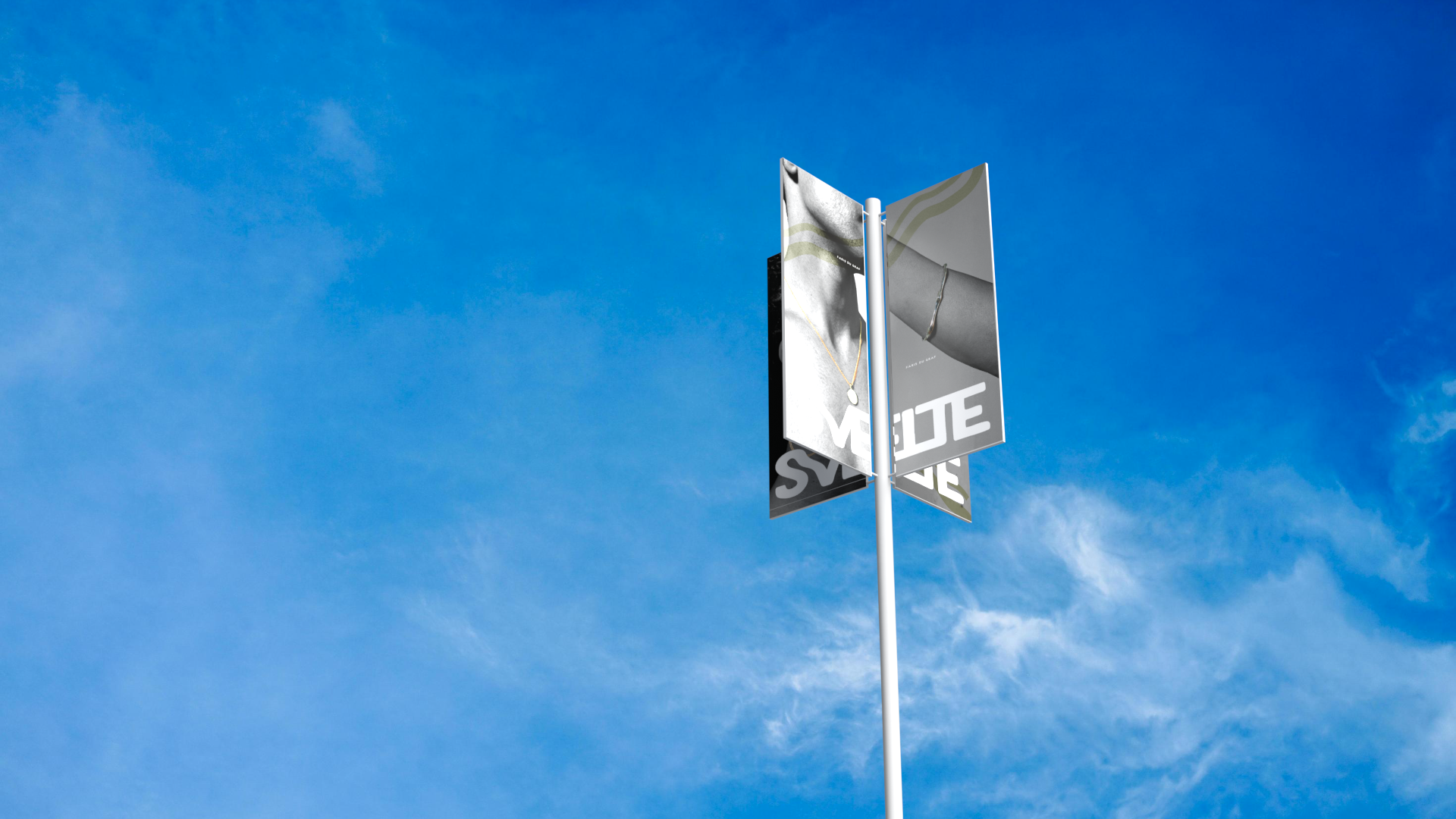
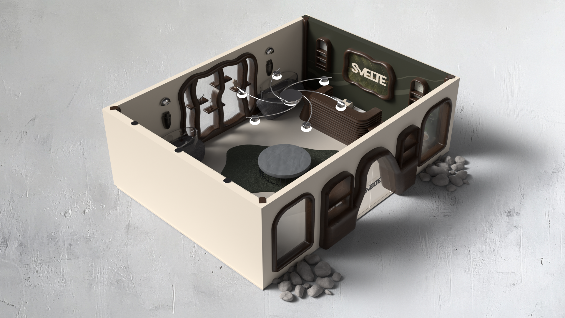
Deliverables plugged into a 3-D mockup using Adobe Dimension.
Product Deliverables
Through each deliverable, I've made a point of building deeper internal touchpoints — deliberately selecting product models constructed from sustainable, recyclable, or biodegradable materials.
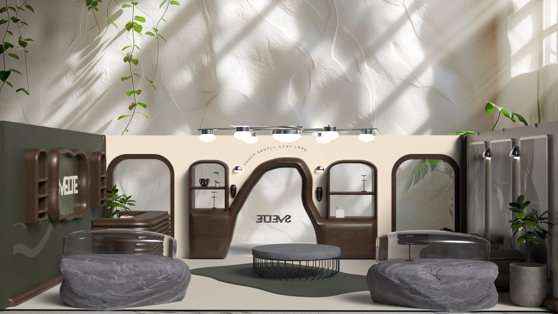
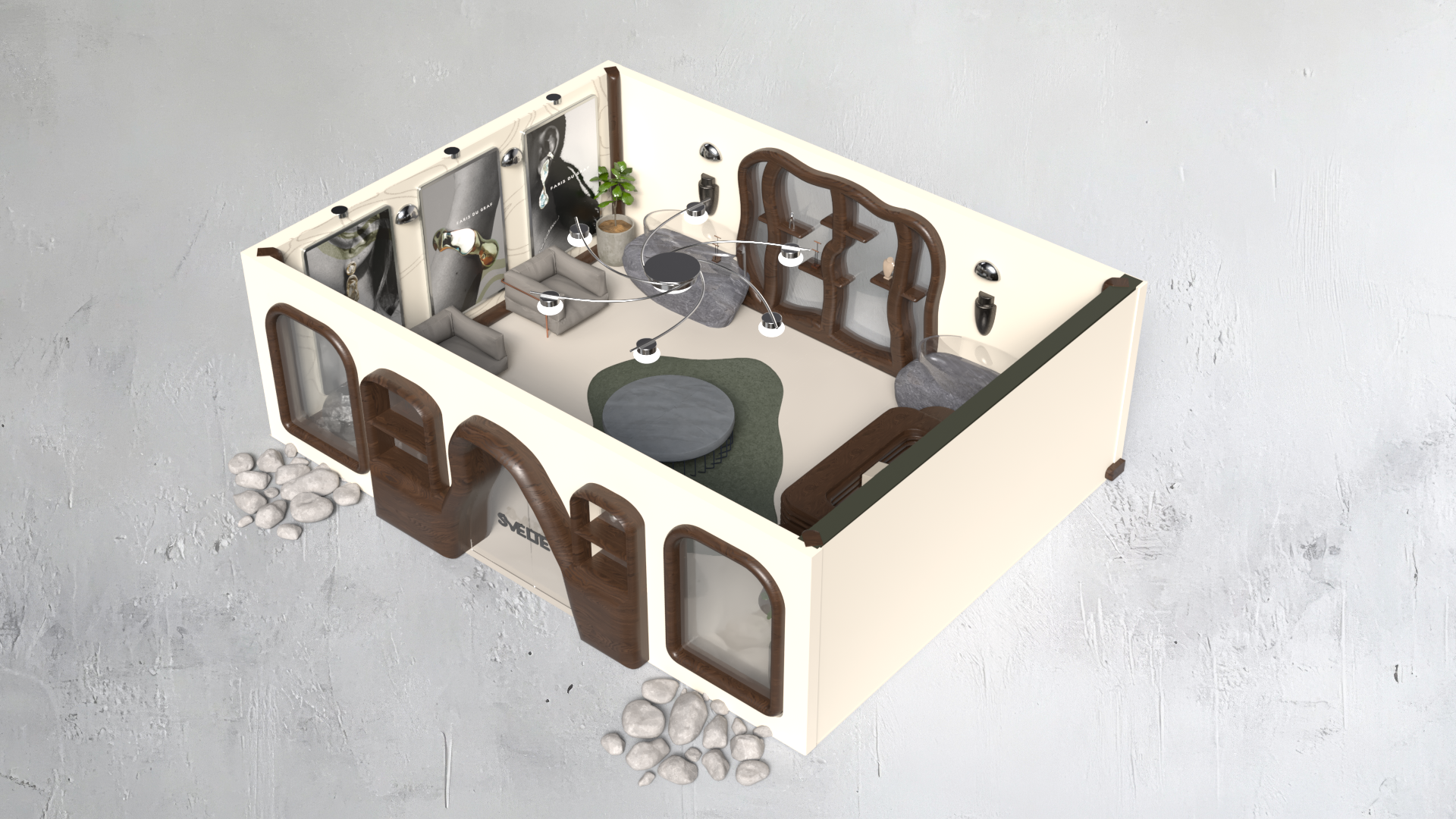
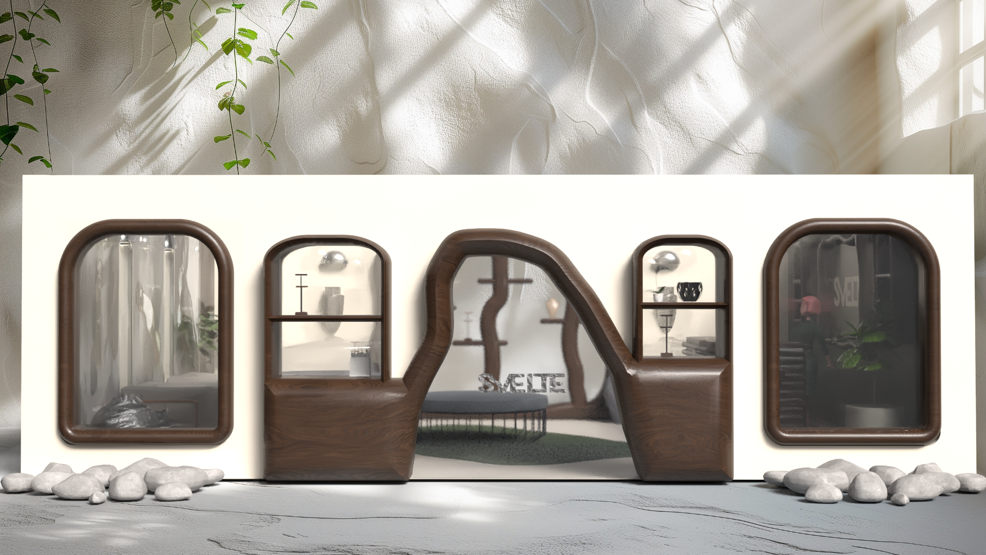
Using Adobe Illustrator, I created flats of the walls and components. Then, I converted custom elements to 3-D .objs to be imported to Dimension and implemented into the space.
Flats
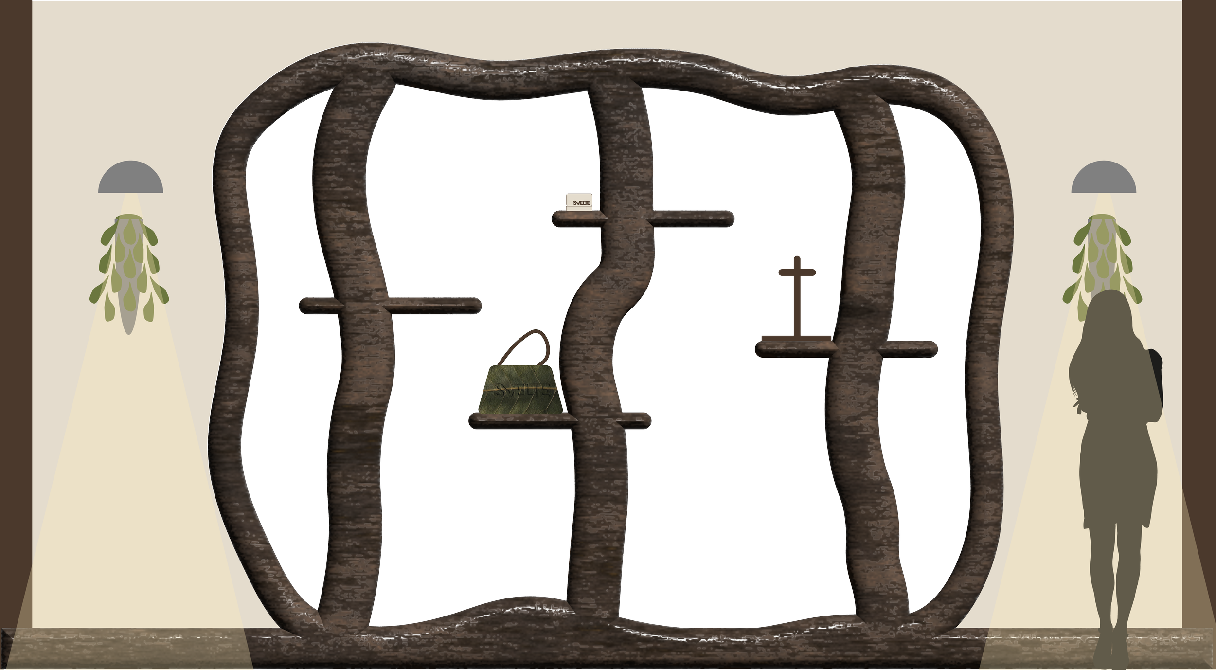
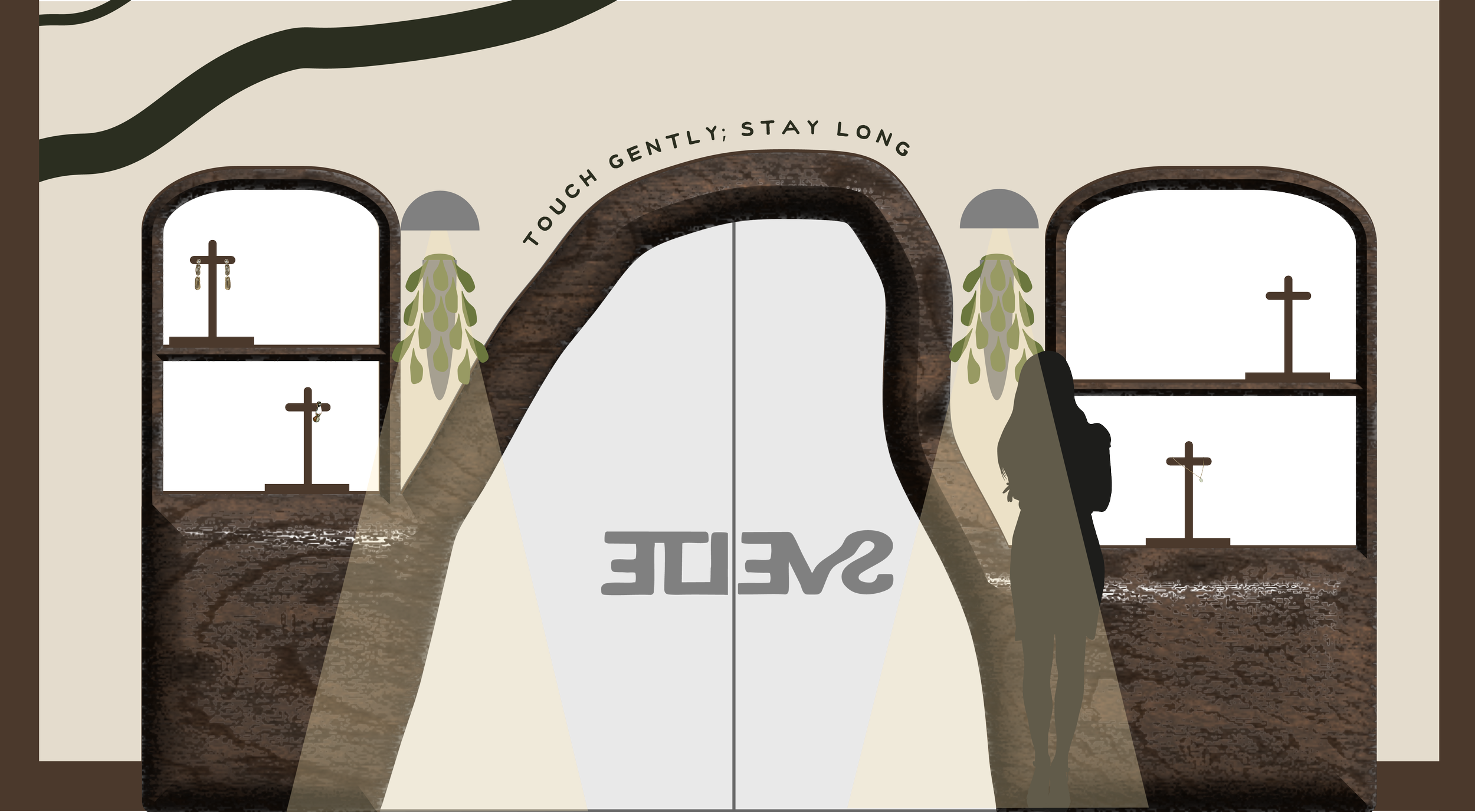
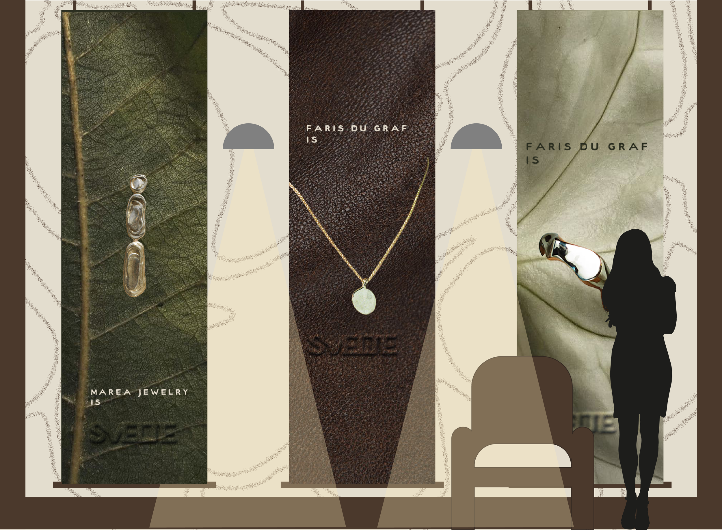
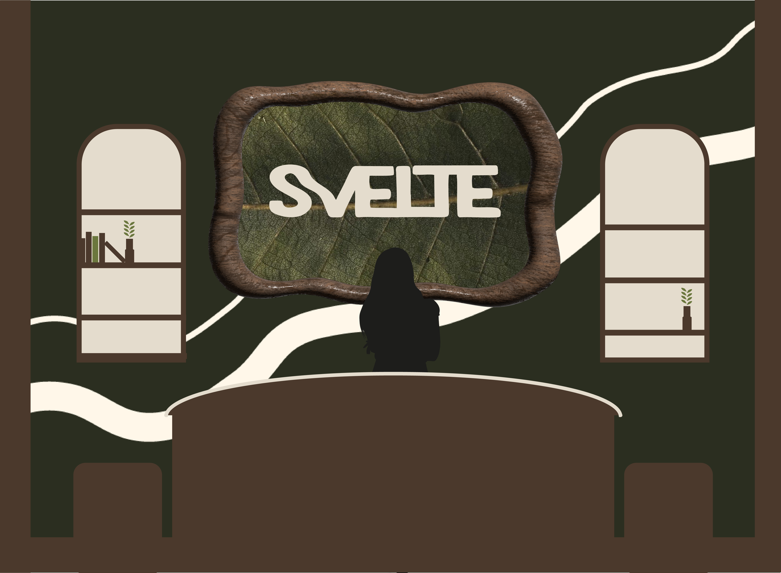
conceptual space
Below, is my final solution. The final space offers a realized intersection between organic material and movement. The palette is neutral, so as not to overwhelm the client, the signage clearly displays artist work, and the environment aims to bring a refreshed feeling to what client-facing foundry spaces have been in the past.