svelte:
touch gently,
stay long
SVELTE is a Jewelry-Smithing space dedicated to the raw process of creating unique pieces. As a principle, our in house smithers strive to elevate above the commercial and craft pieces that demand gentle attention. Offering silversmithing classes to allow tradition to live through you, and a display for patrons to purchase pieces crafted by local artists, we are the intersection of elegance and art— we are SVELTE
❋ The Goal
Create branding and experiential ideation for a local and independent jewelry collective.*
*This is a student project.
❋ The Inspiration
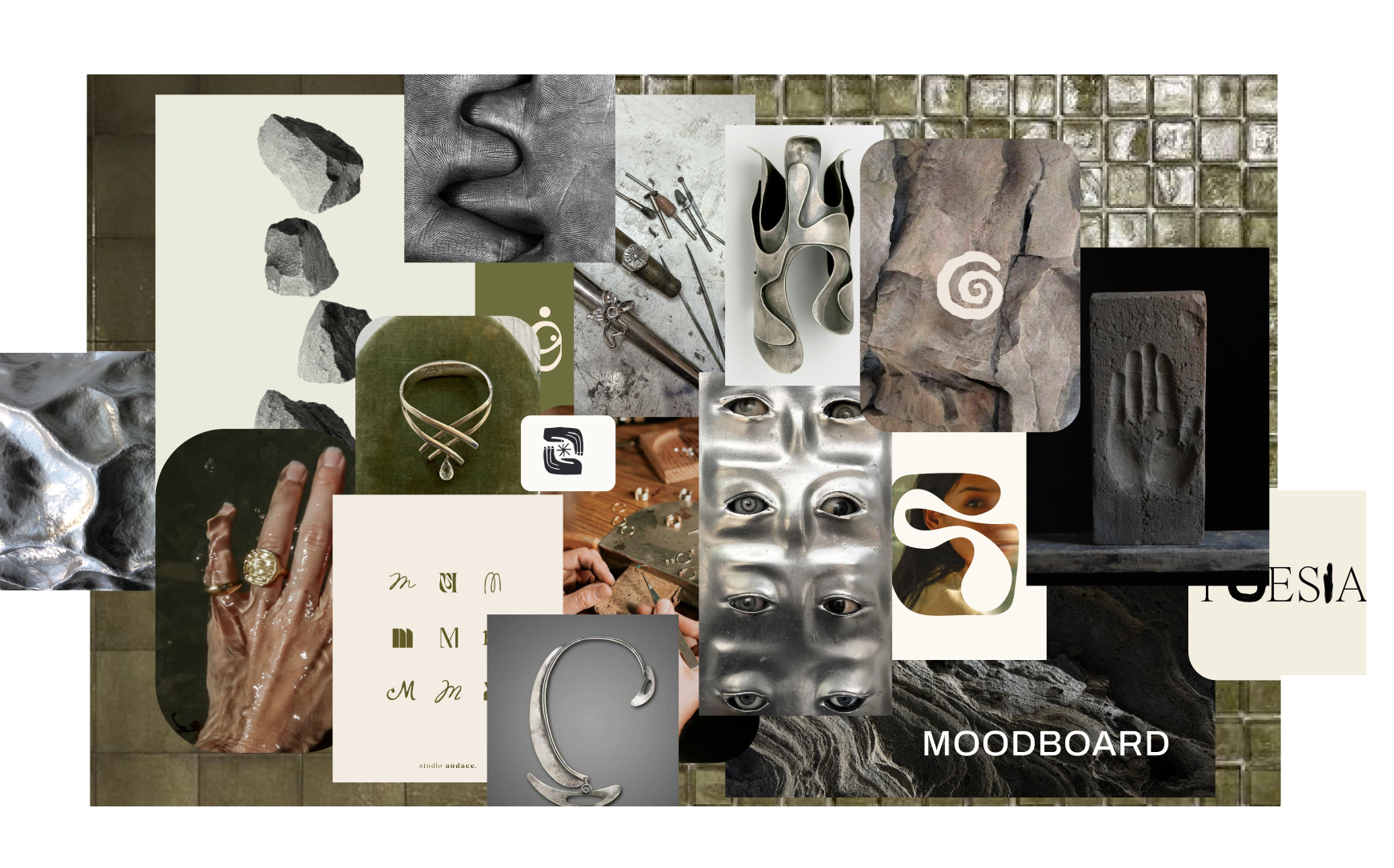
The branding focuses on the similarities between solid and liquid as materials that move between states. Molten lava, melted glass, and the weaving fibers of treebark inspire graceful and practical application to every touchpoint and space.
MOODBOARD
ORGANIC
DELICATE
INTIMATE
Logo story

TAY LULU


Kerning Minimized
Mimicking Lava Flow/Melted Metal


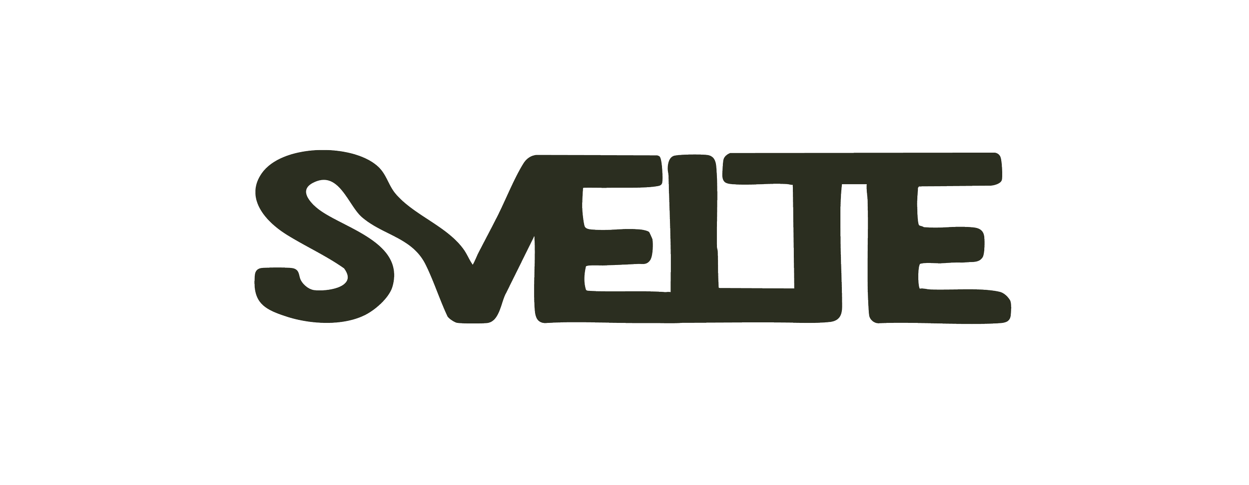
Welded Together
This logo focuses on the similarities between metal and stone. Both elements are associated with being interchangeably cool or warm- smooth or jagged; hard or soft. This logograph allows space for both to coexist. I imagine the space this introduces to harness the same ideals. Think glass tile with peppered grout, stainless steel chairs, and quartz-riddled granite countertops.
APPLICATION
I sought out and sourced imagery from independent jewelers directly — crediting their work with full permission — and crafted handmade secondary elements into signage that actively champions their practice.
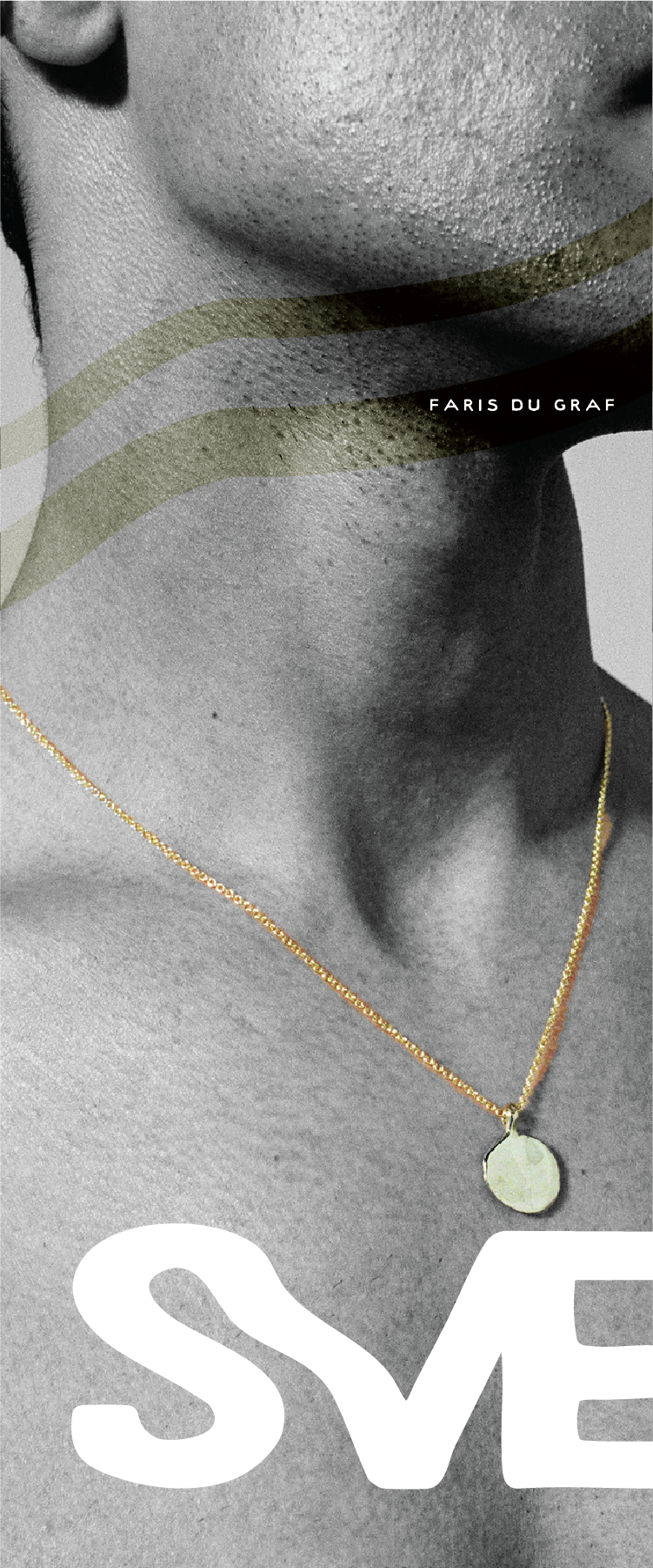
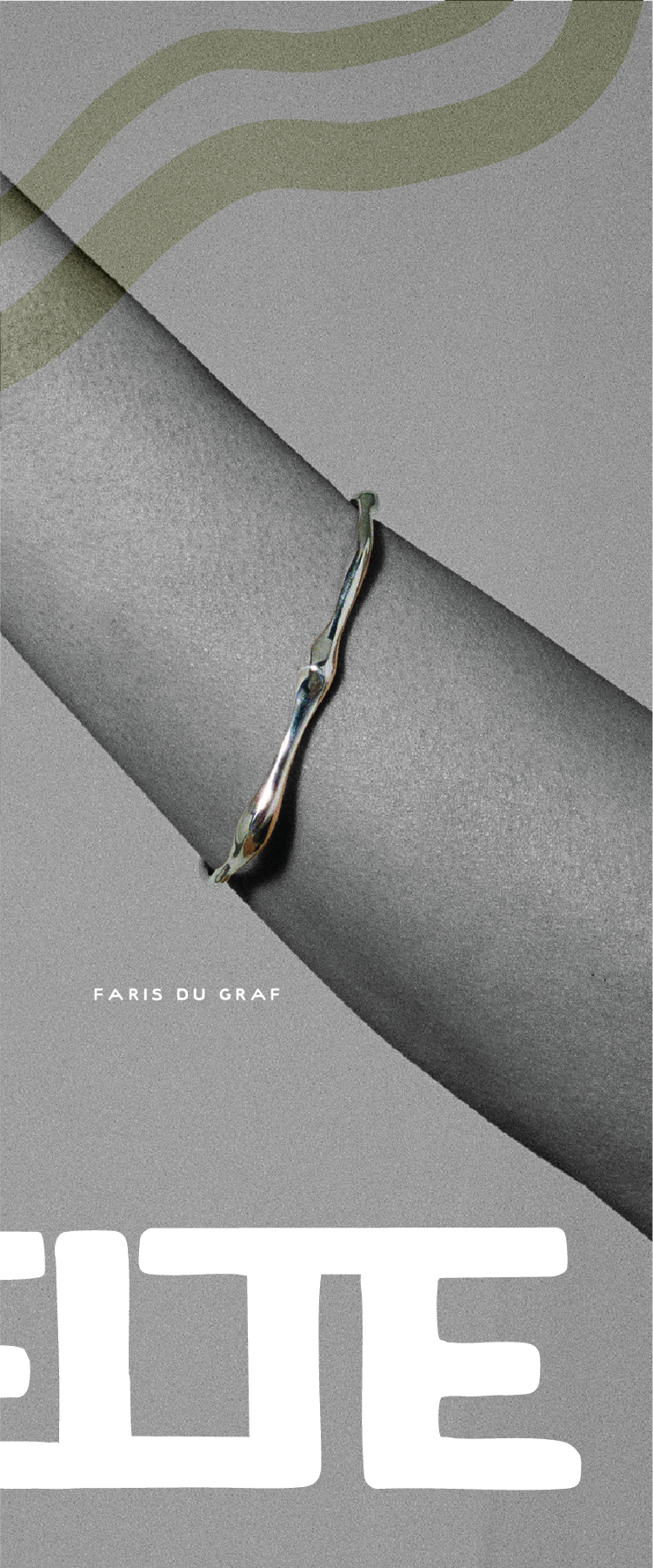
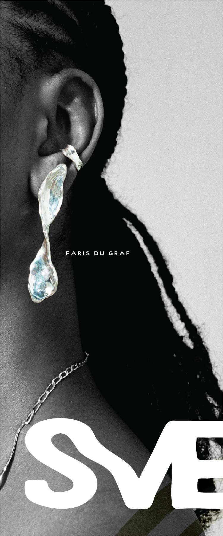
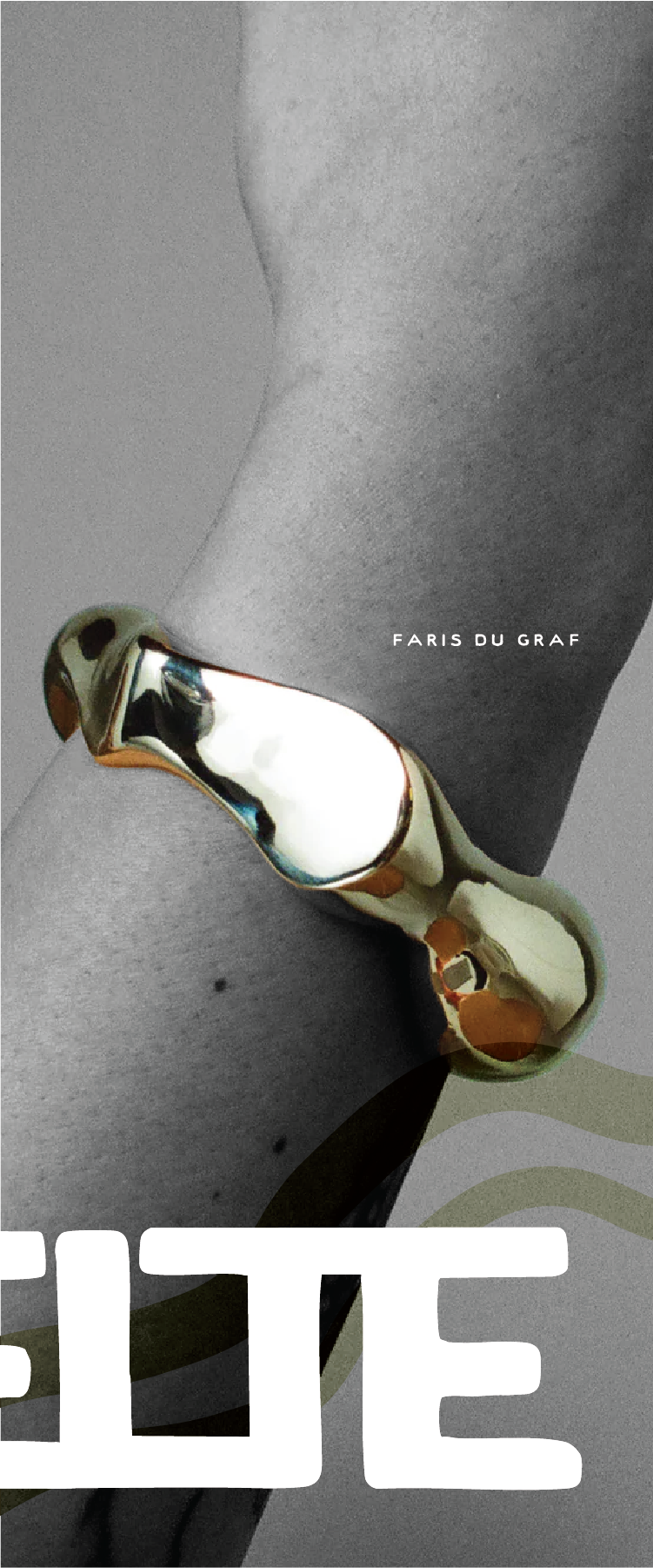
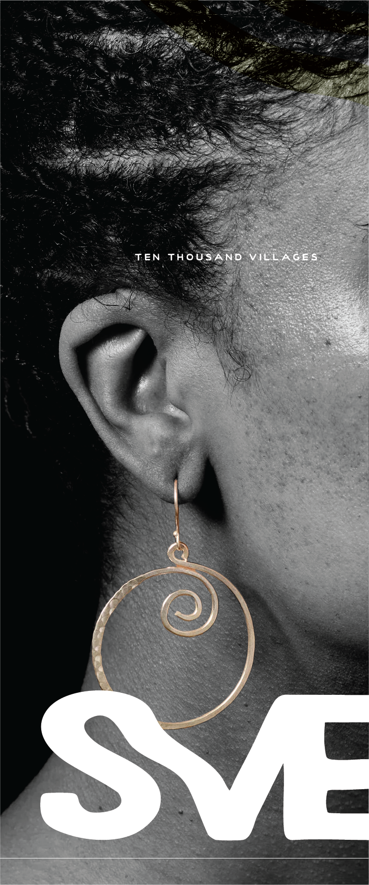
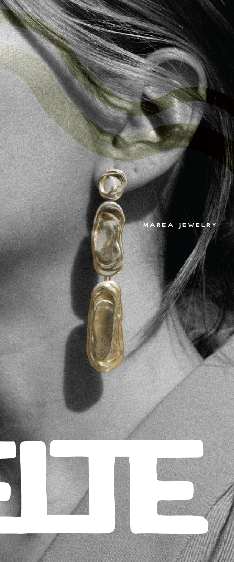
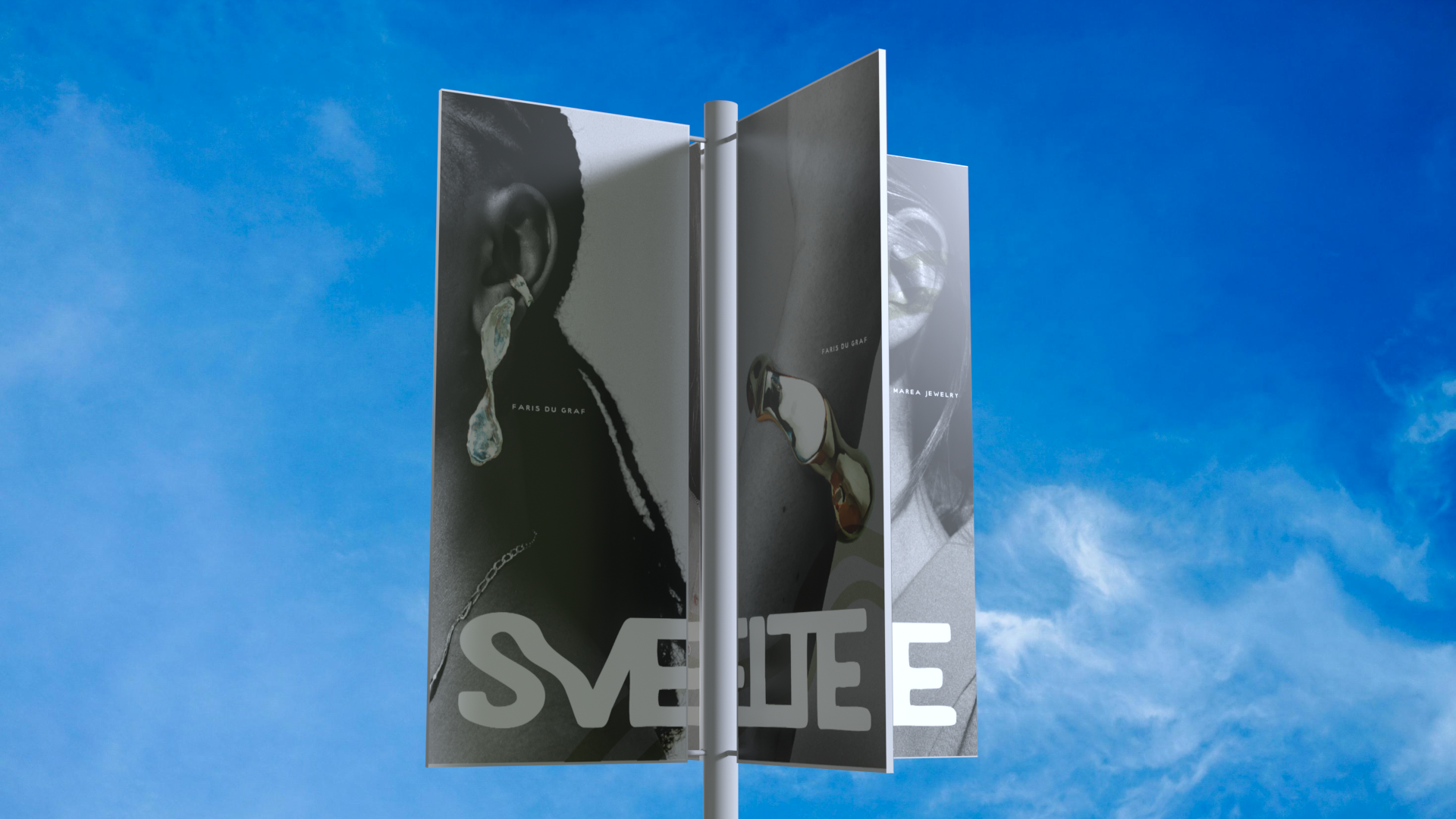
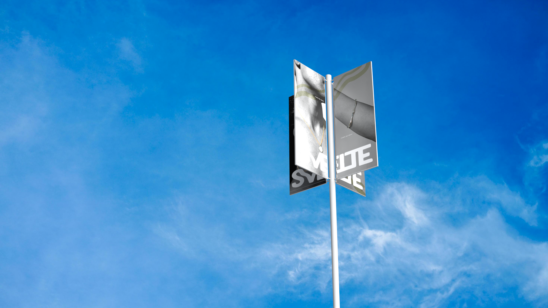
Deliverables plugged into a 3-D mockup using Adobe Dimension.
Product Deliverables
Through each deliverable, I've made a point of building deeper internal touchpoints — deliberately selecting product models constructed from sustainable, recyclable, or biodegradable materials.
Using Adobe Illustrator, I created flats of the walls and components. Then, I converted custom elements to 3-D .objs to be imported to Dimension and implemented into the space.
Flats
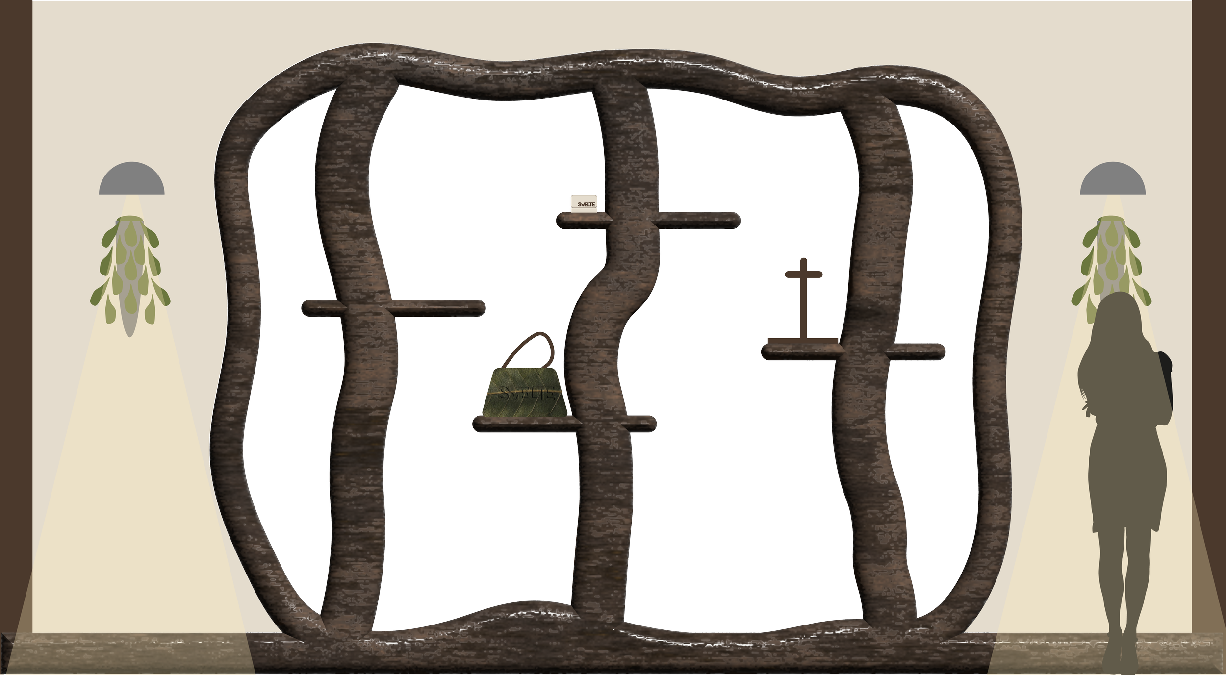
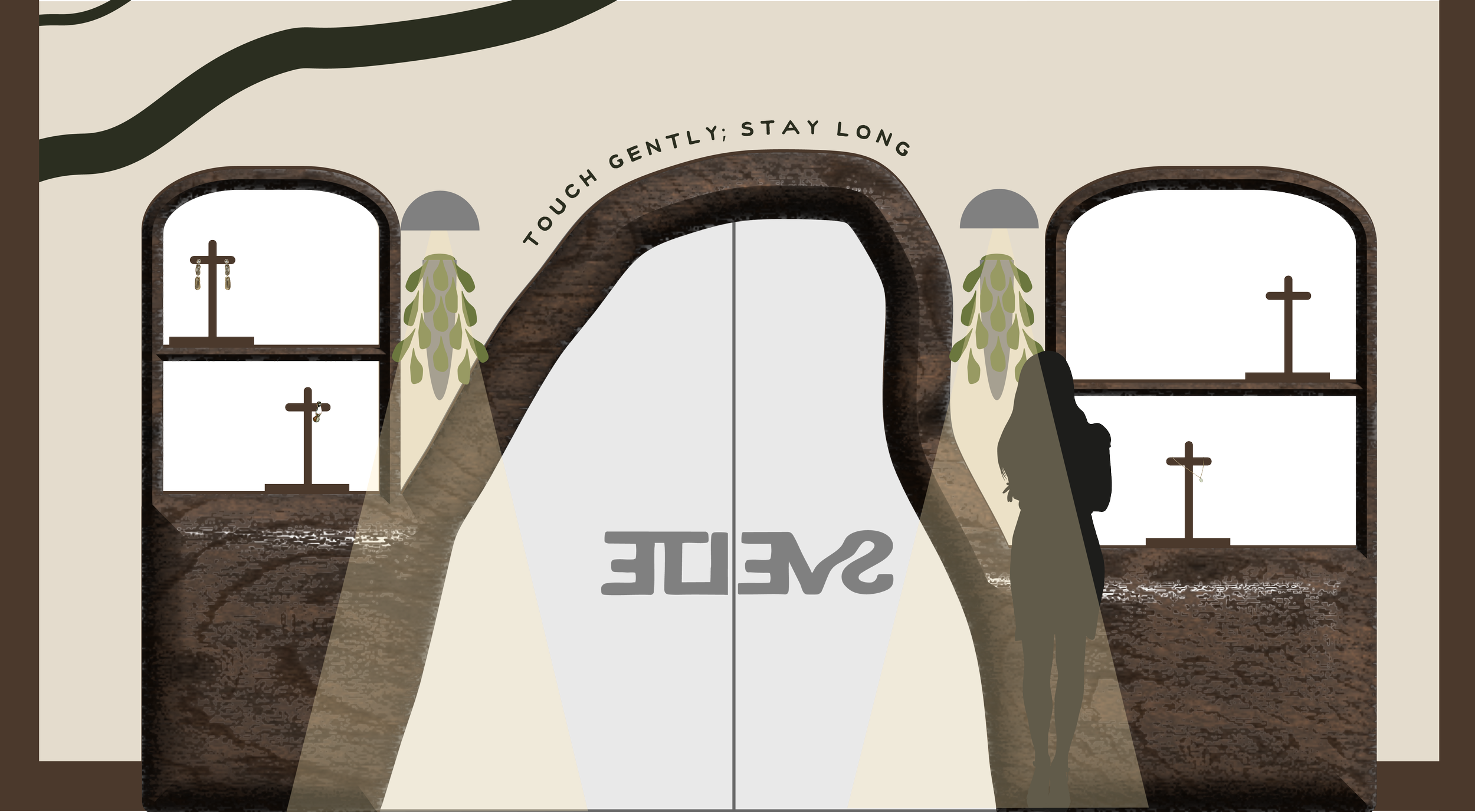
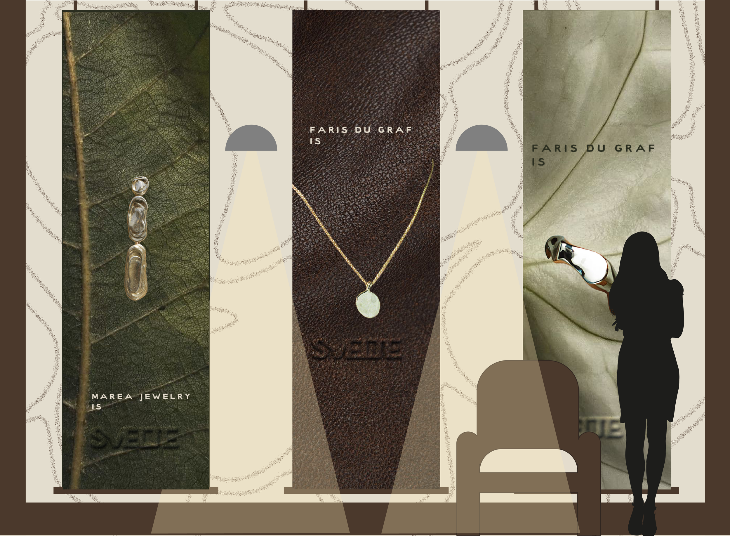
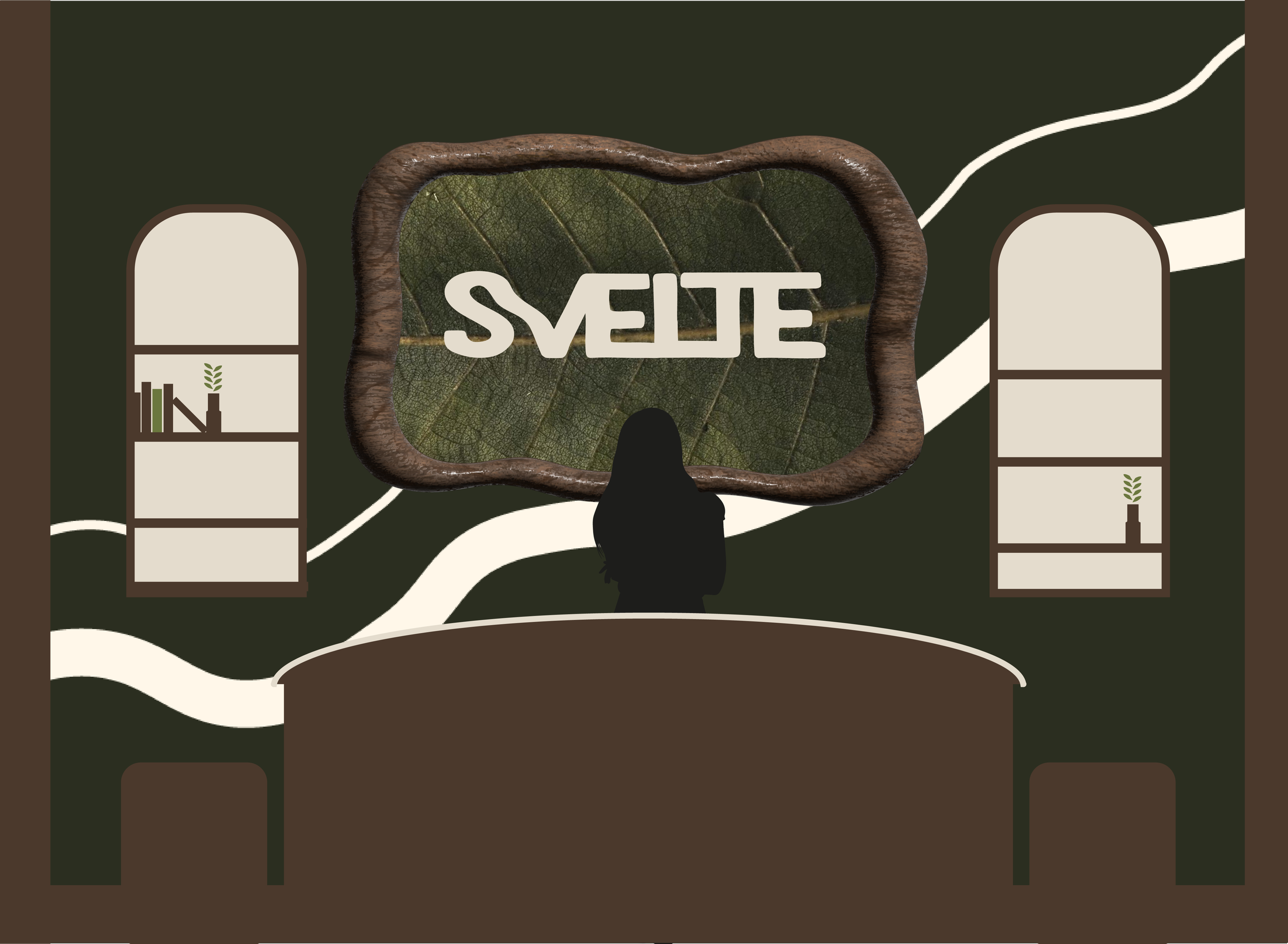
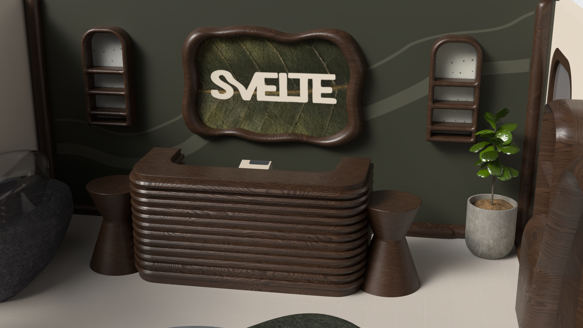
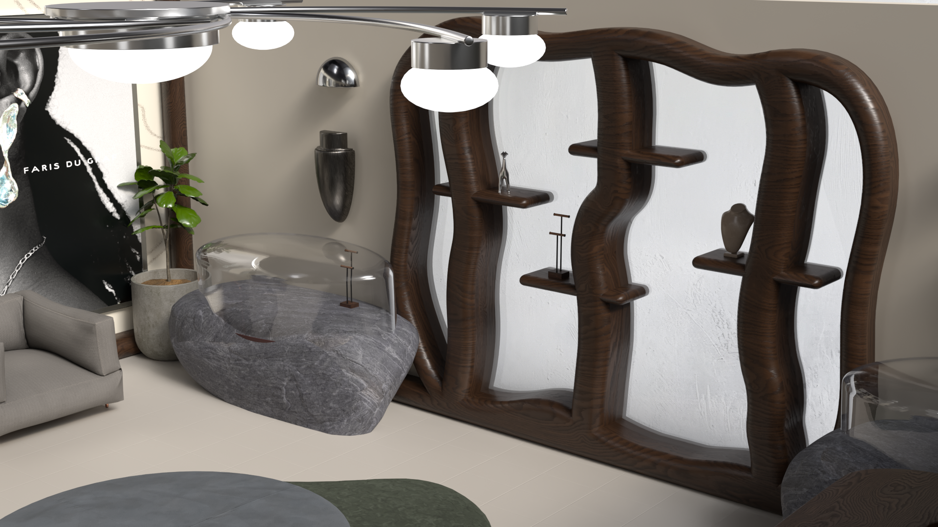
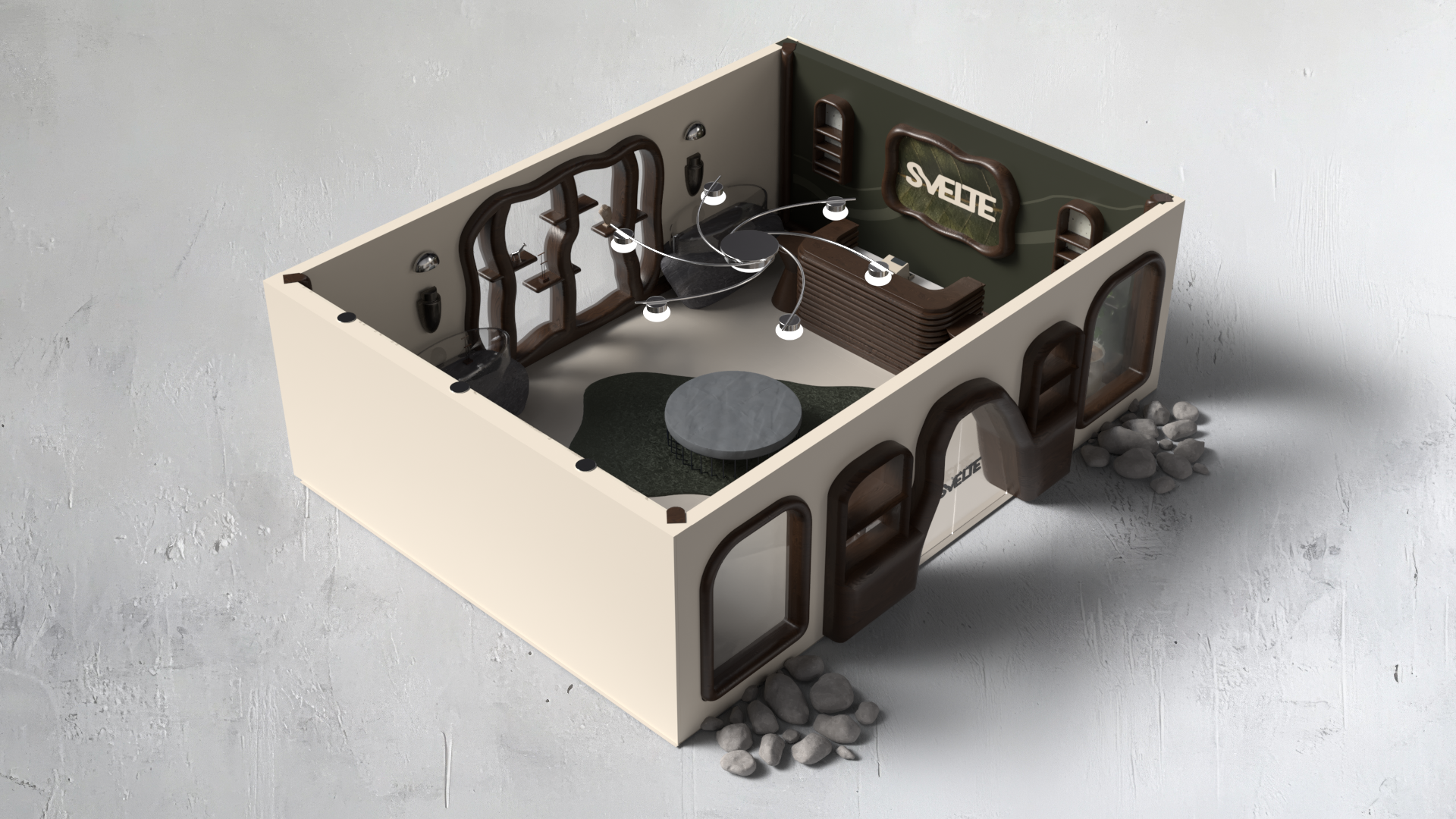
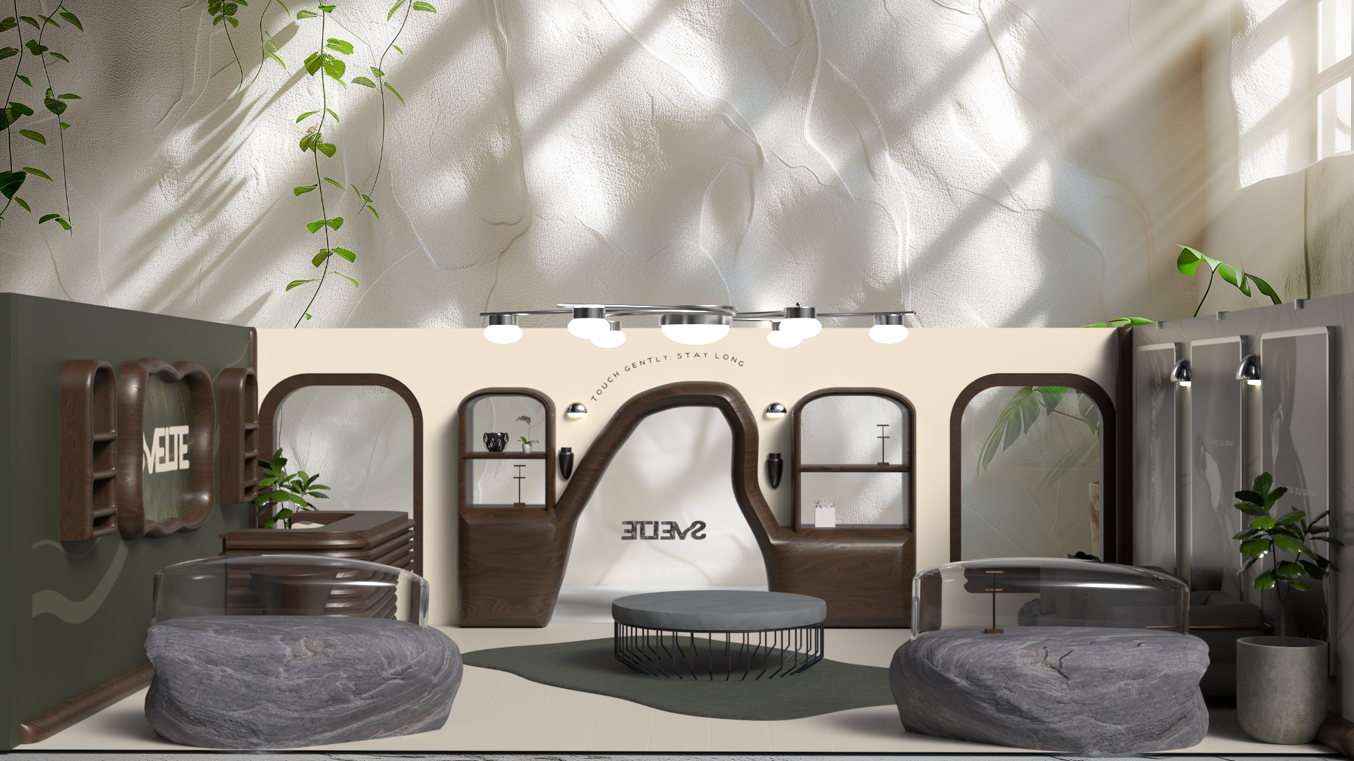
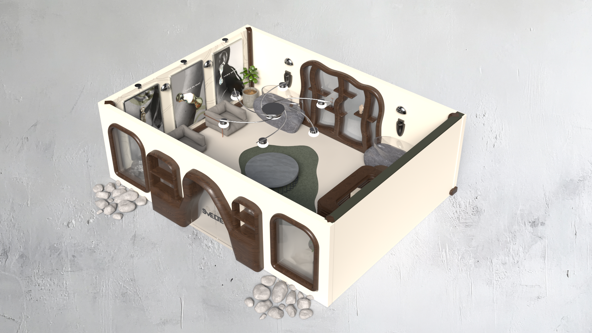
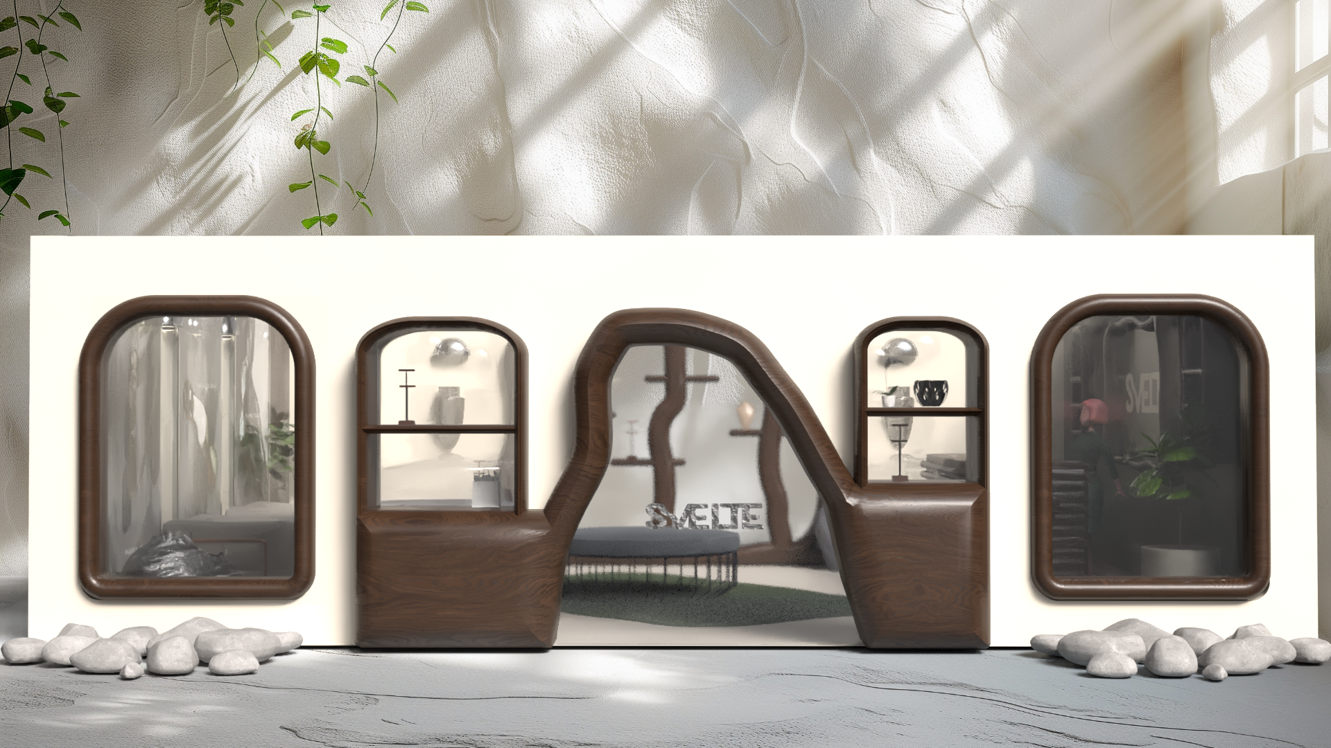
conceptual space
Below, is my final solution. The final space offers a realized intersection between organic material and movement. The palette is neutral, so as not to overwhelm the client, the signage clearly displays artist work, and the environment aims to bring a refreshed feeling to what client-facing foundry spaces have been in the past.